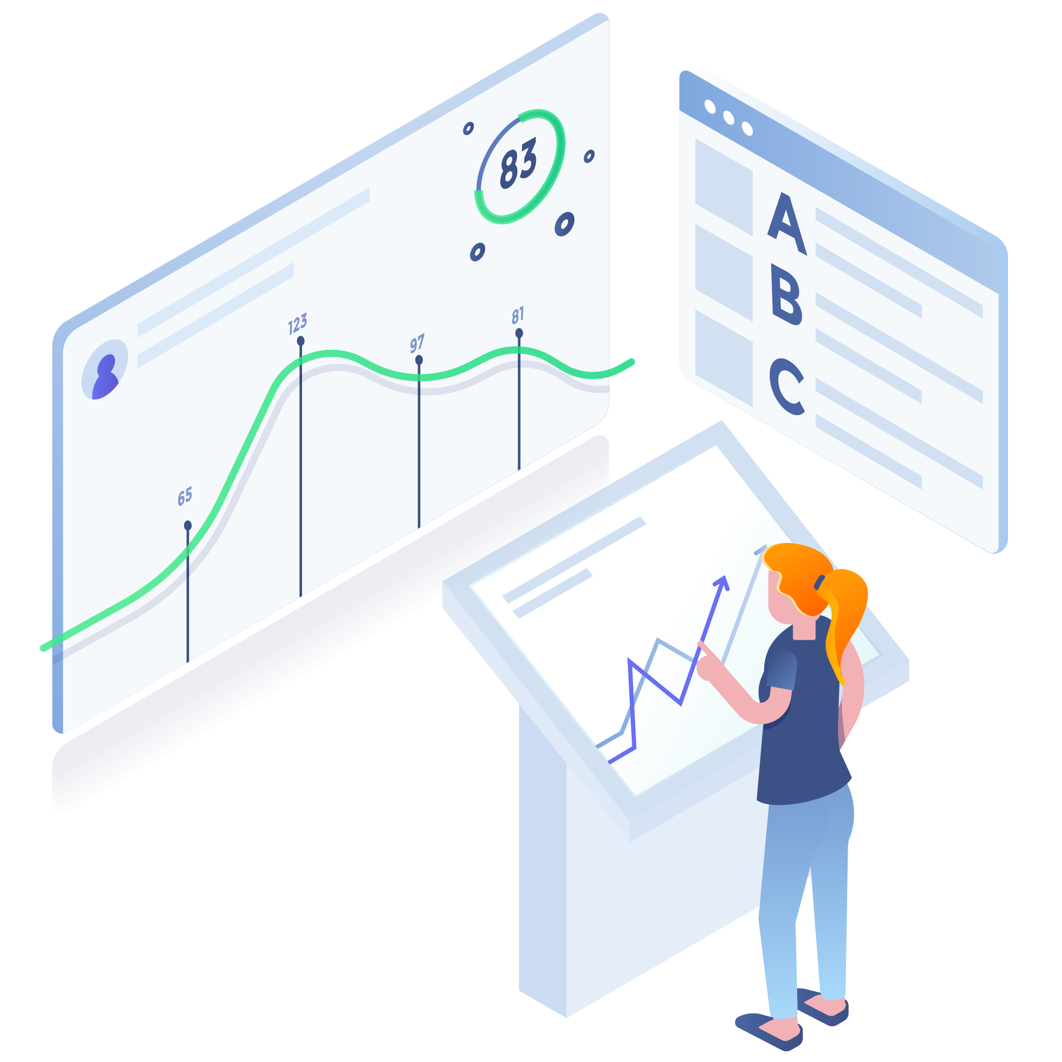
Indicators Made Explorable
Explore how data evolves over time, locations, and dimensions.
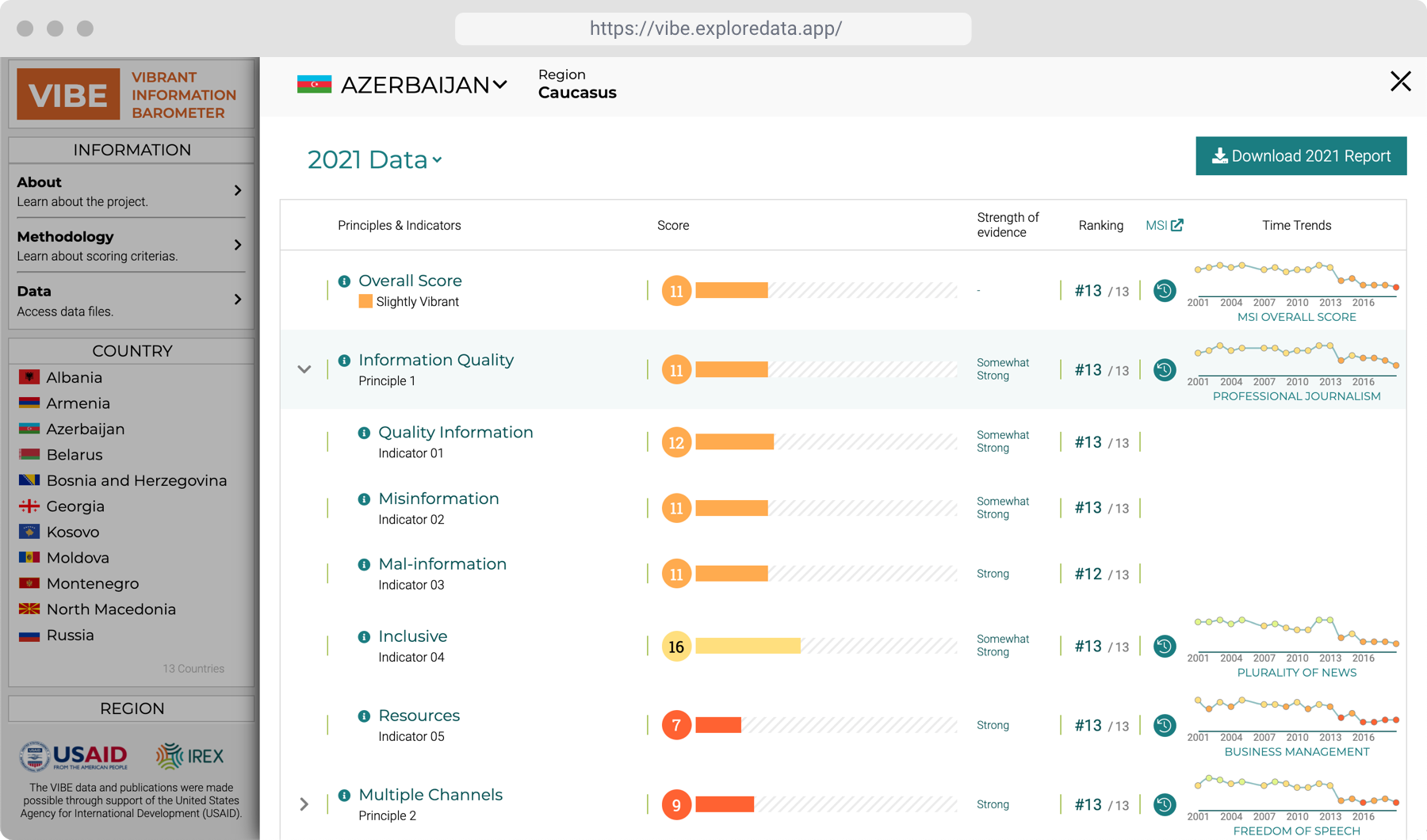
With Keshif’s unified dashboarding environment, you can effortlessly visualize and explore indicator data. Keshif’s automated interactive charts enable analysis over time, locations, and dimensions.
Actionable incident trends…
Annual, monthly, daily, or any other frequency. Development indicators, frequency and impact of incidents, financial metrics, scientific measurements,
Time-trends
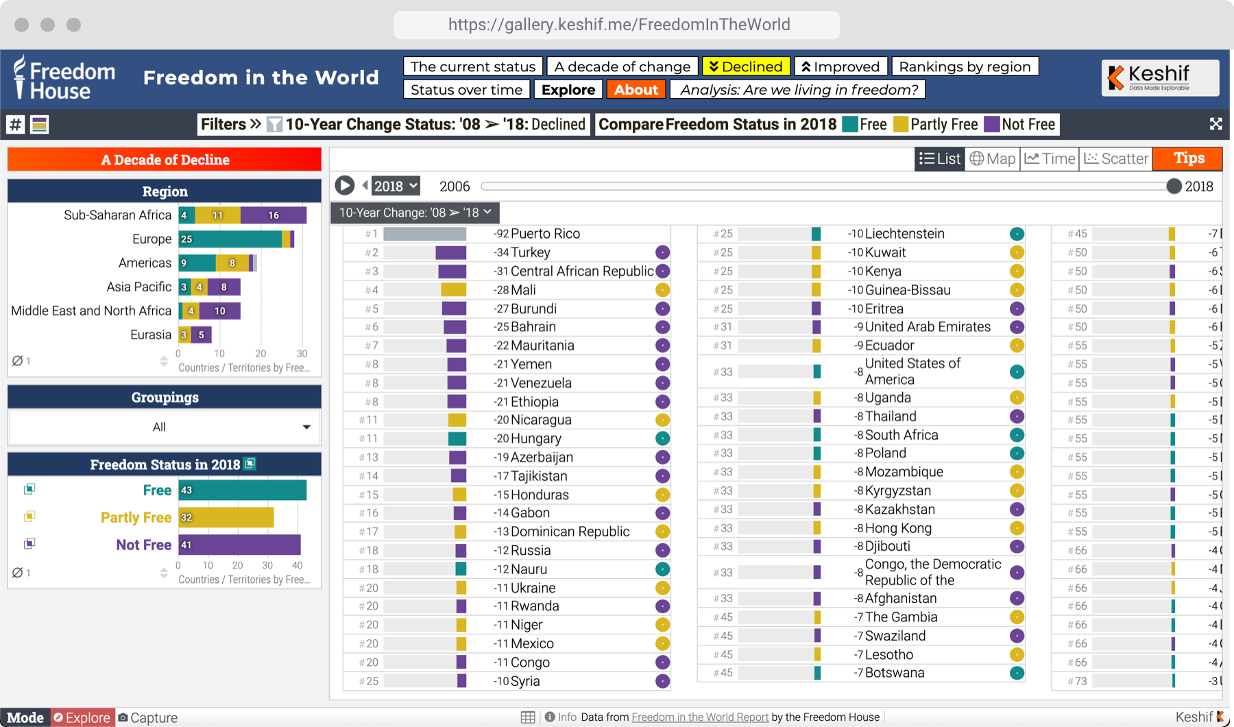
You can highlight, filter, and compare data across data groups, such as by regions. Keshif also allows you to change the type of charts with a single click, and creates rich visual pop-ups when hovering over records.
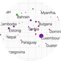
Discover hot-spots in point locations. Zoom in and discover more with dynamic, responsive maps.
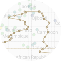
Reveal impact numbers and event frequencies across regions, states, cities in interactive choropleth maps.
Transform individual incidents to aggregated time trends for analysis with our indicator solutions.
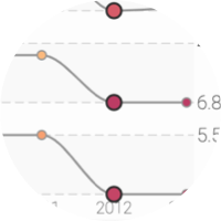
Instantly compare and differentiate trends across factors, actors, & outcomes with a single click.
Incidents from any data source & format
Our solutions can ingest thousands of incidents from external databases (open-source projects such as ACLED, GTD, APIs, data files… ) surveys, media and so on.
Incidents anywhere, any time, any details
Our visual analytics technology adopts to existing data features, whether it is by location, time, or actors, types, or impact information
Data collection with tailored methodologies
Access insights with public or private apps
Our secure web applications can be accessible publicly for broad dissemination, or privately for analysts working with sensitive data.
Selected Projects & Partners
View all projects
DT Global
Analyzing the Propaganda and Misinformation in Yemeni Media

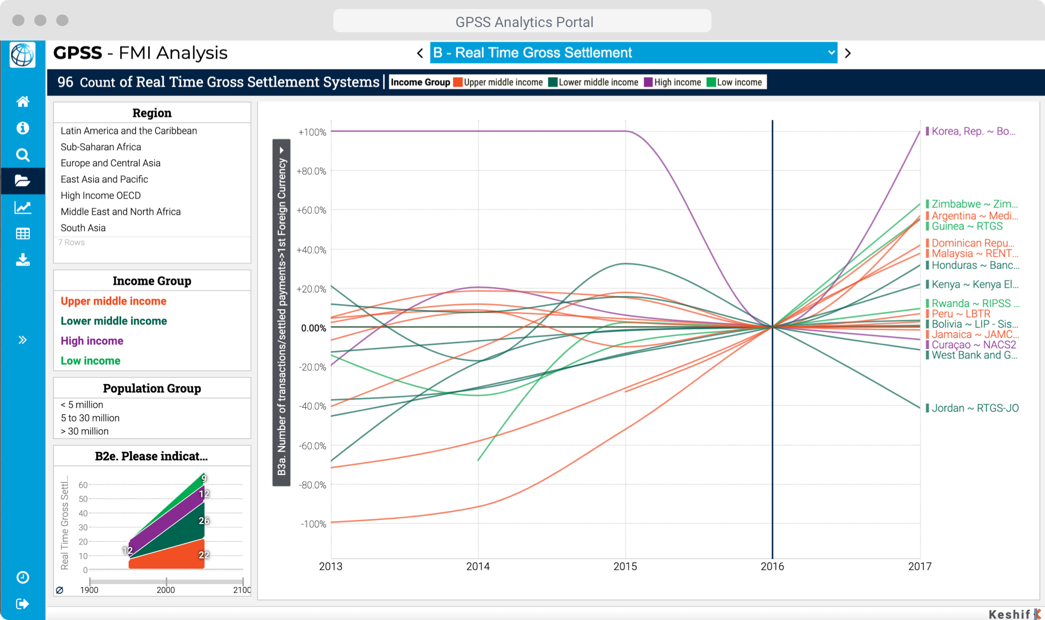
World Bank
Data-Driven Website for Benchmarking Infrastructure Development

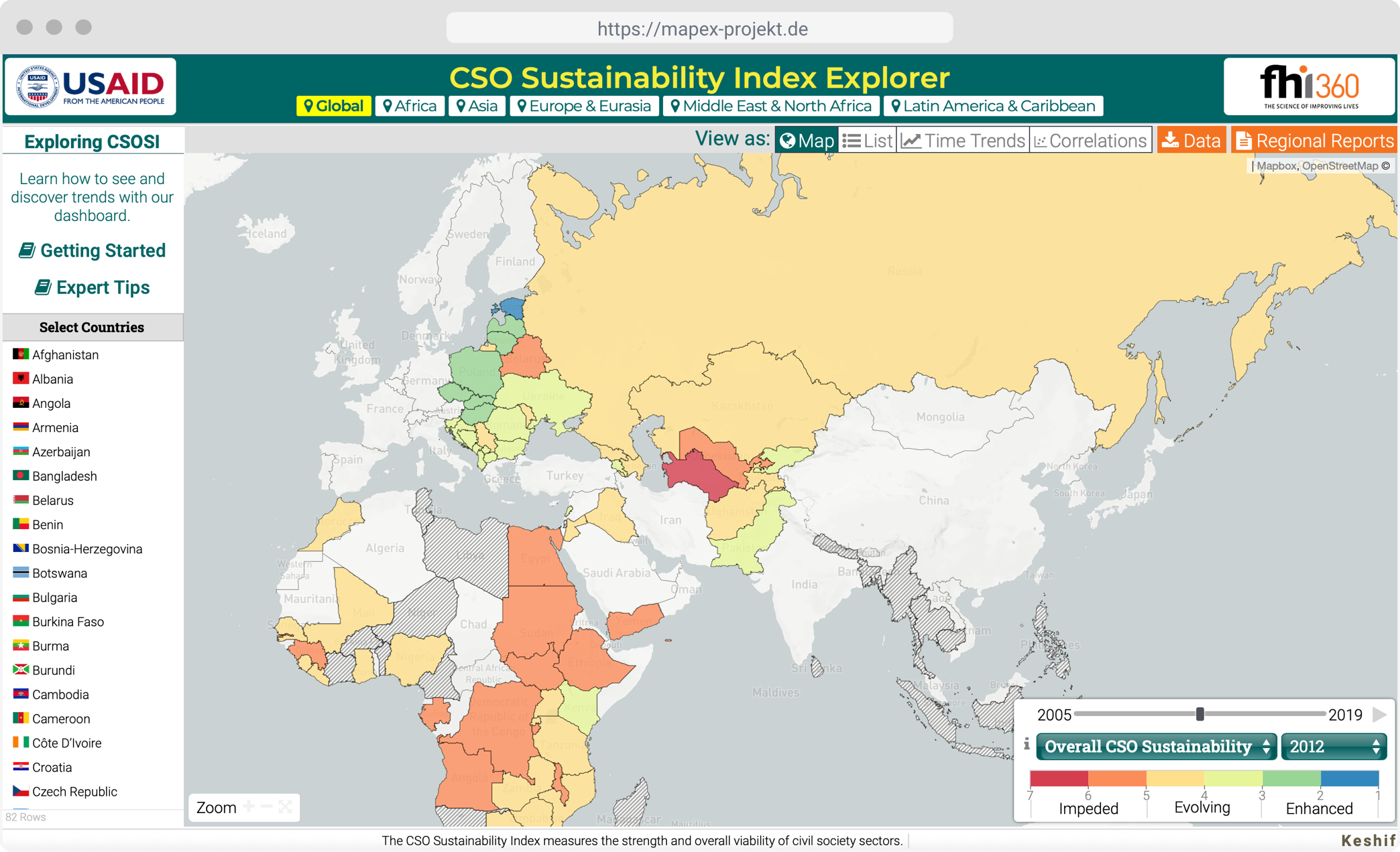
FHI360
Visualizing Civil Society Sustainability Worldwide